Shaping Mitie’s New Visual Identity
Mitie set out to move beyond traditional facilities management and become a catalyst for thriving communities. By refreshing its corporate narrative and visual identity, the aim was to create something bold yet recognisable to Mitie, centred around the its new purpose: “Better Places; Thriving Communities”.
Working in a small design team of three, I helped define the creative direction of the visual identity and bring this new narrative to life.
Together, we shaped the new identity that feels genuine, contemporary and connected to people, reflecting how Mitie helps to ‘weave the fabric of modern society’.
Senior Designer
Rebrand, Brand Identity, Creative Direction
Reconnecting people and purpose
The existing brand had been in place for over eight years and over time it had become fragmented and inconsistent. Different design styles had emerged, visual assets no longer aligned and many colleagues felt uncertain about how to represent the brand.
Our challenge was to reignite that connection, to bring people back together and to create a sense of pride and excitement in producing work that truly felt on-brand.
This new positioning for Mitie needed to reflect the essence of the brand and capture our positioning. The future of high-performing places.

Examples of some of Mitie's mismatch branding over the years
Making the Brand Feel Like Mitie Again
With over 75,000 colleagues across the business and a brand team of just three designers, alignment and capacity were a few of our biggest challenges.

1st stage concepts of the new brand refresh
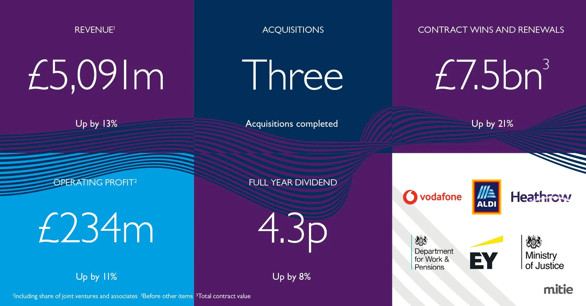
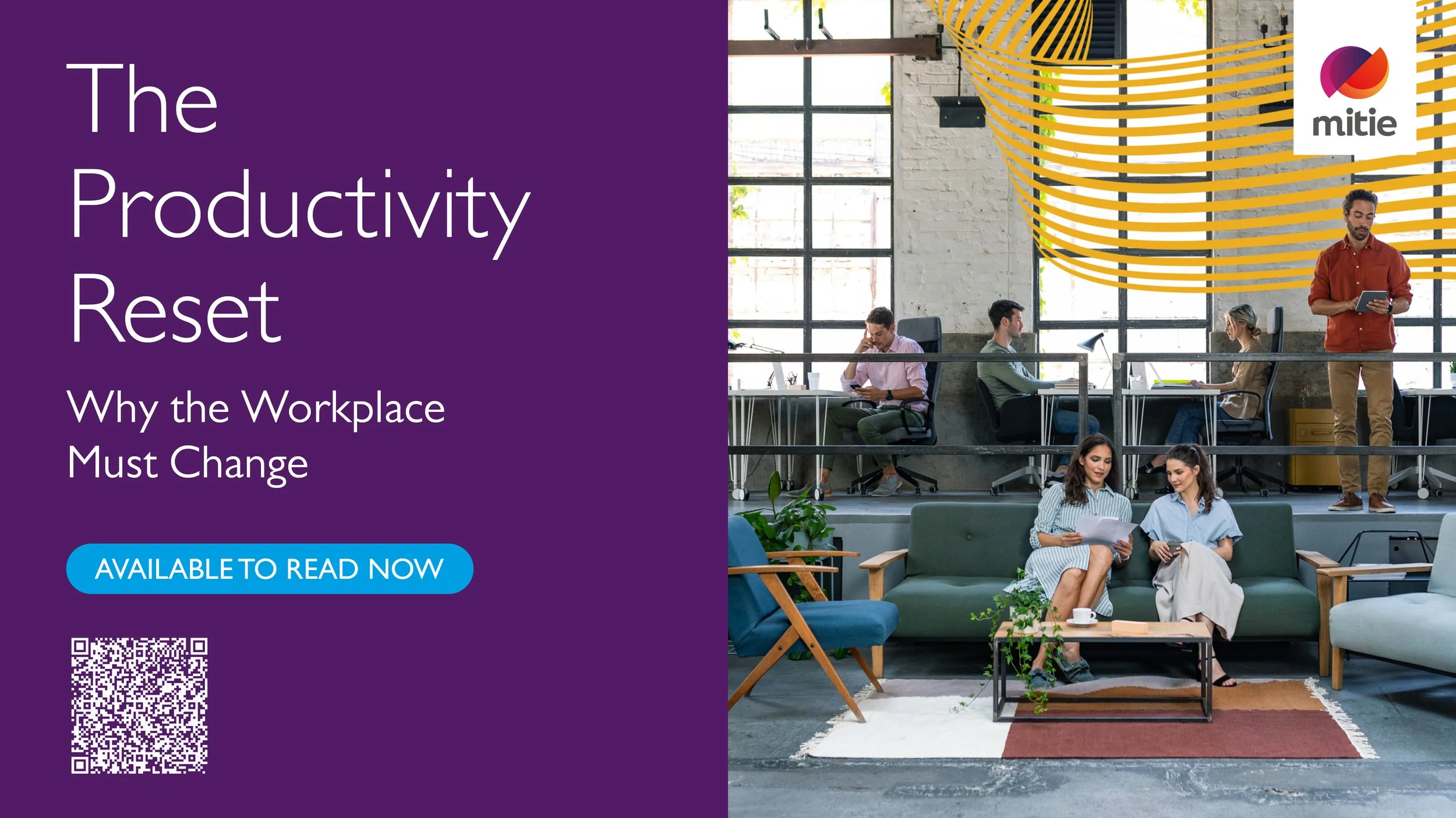
Brand Relaunch Highlights (Paid)
1.6m+
Paid video views (Youtube, March–November 2025)
2.8m+
Paid Impressions:
14,369
Paid clicks to site:
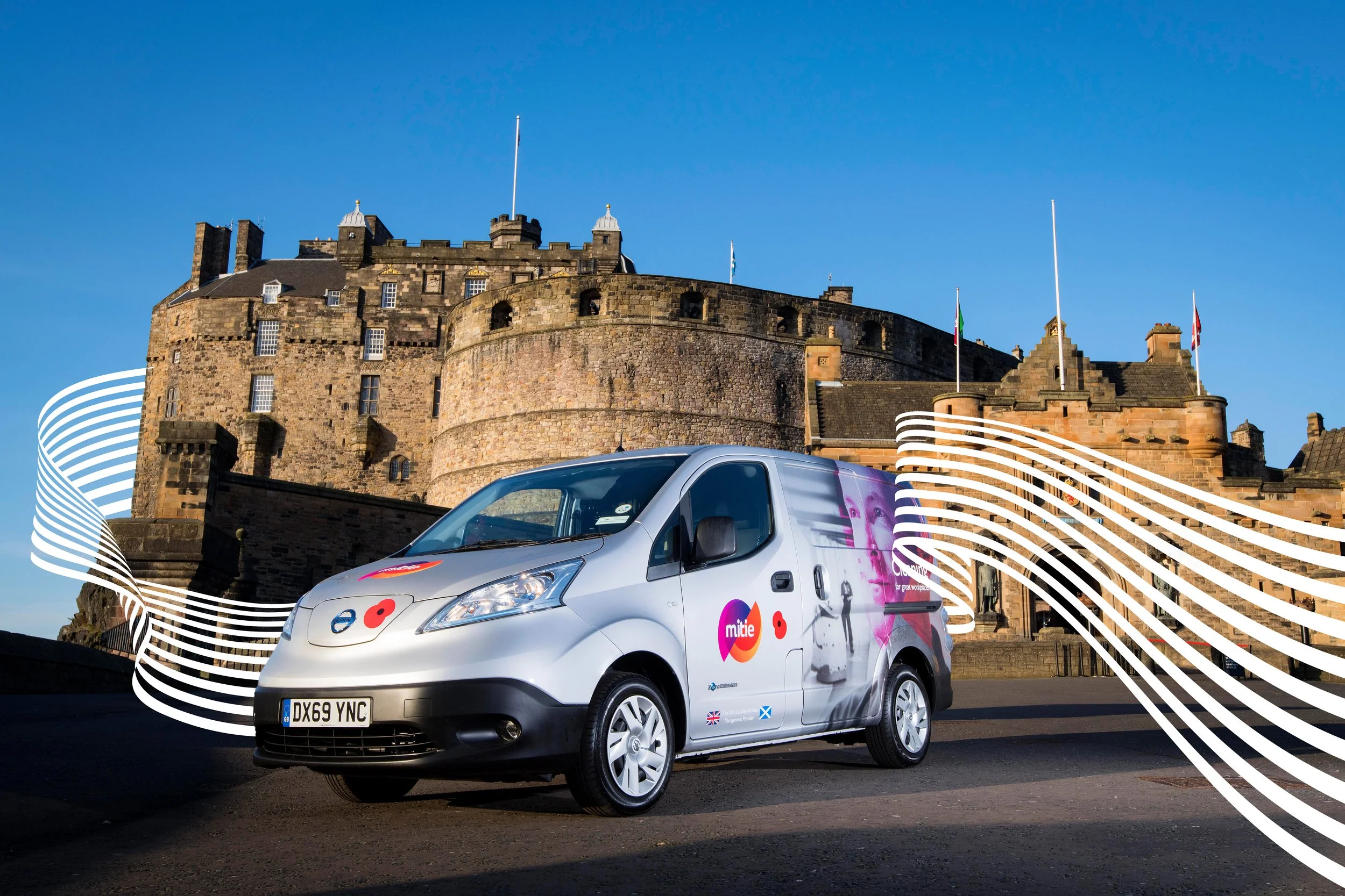
As the senior graphic designer, I worked with the creative agency to develop Mitie’s visual concepts into a clear and cohesive brand identity. I defined the fabric line amount and its uses, rebalanced the colour palette to make Yellow and Cyan feel bright and energetic, and refocused the design on what matters most for colleagues.
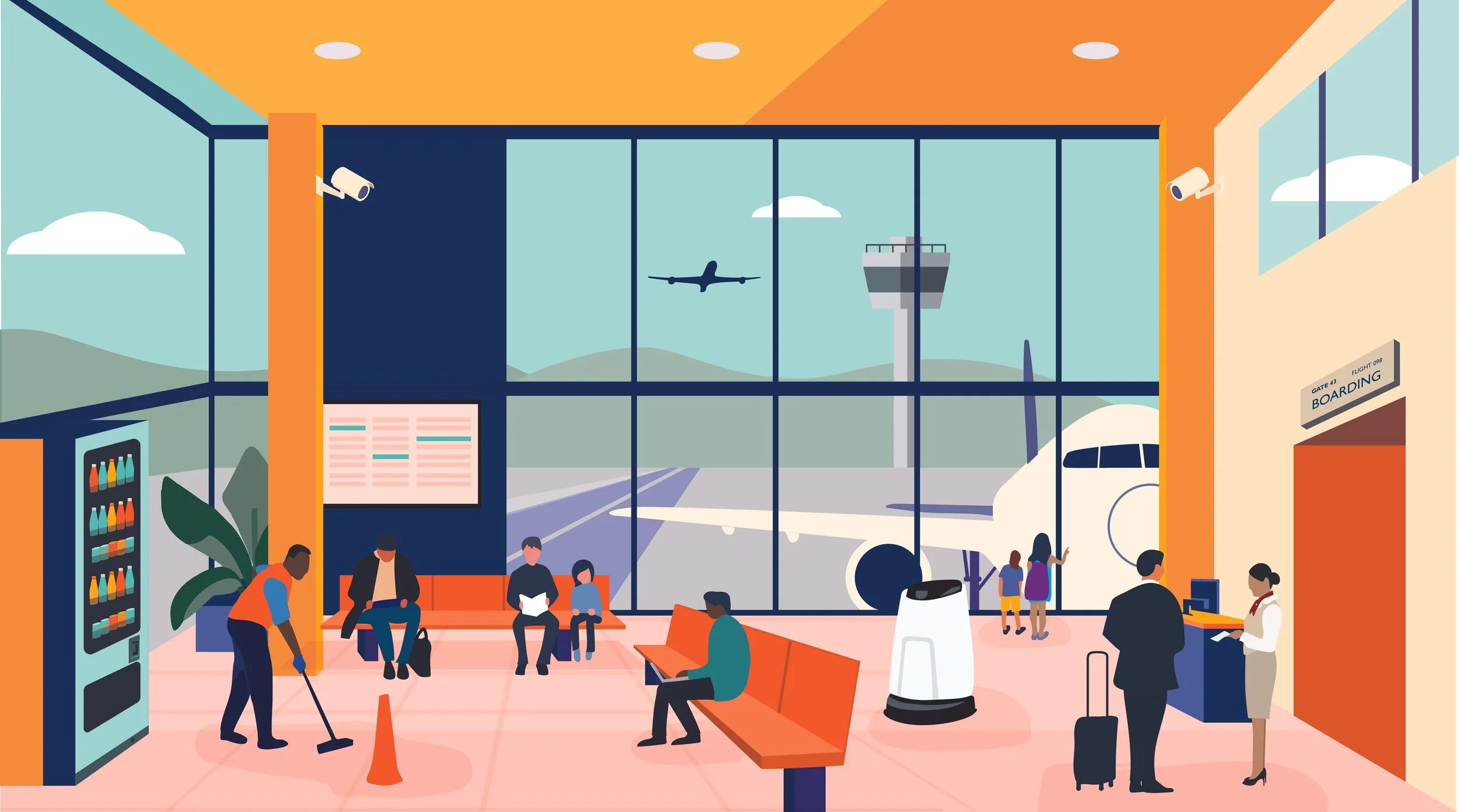
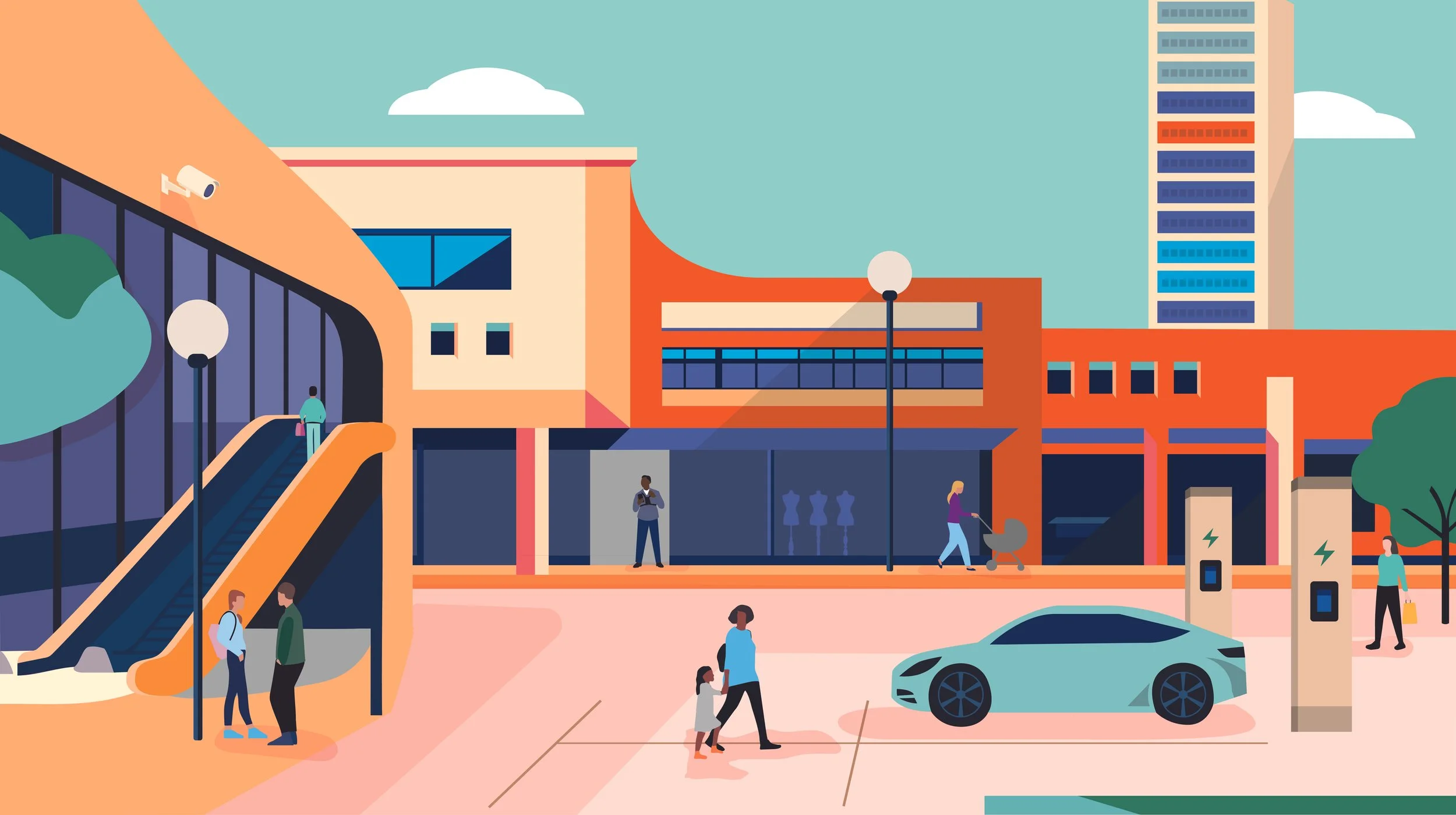
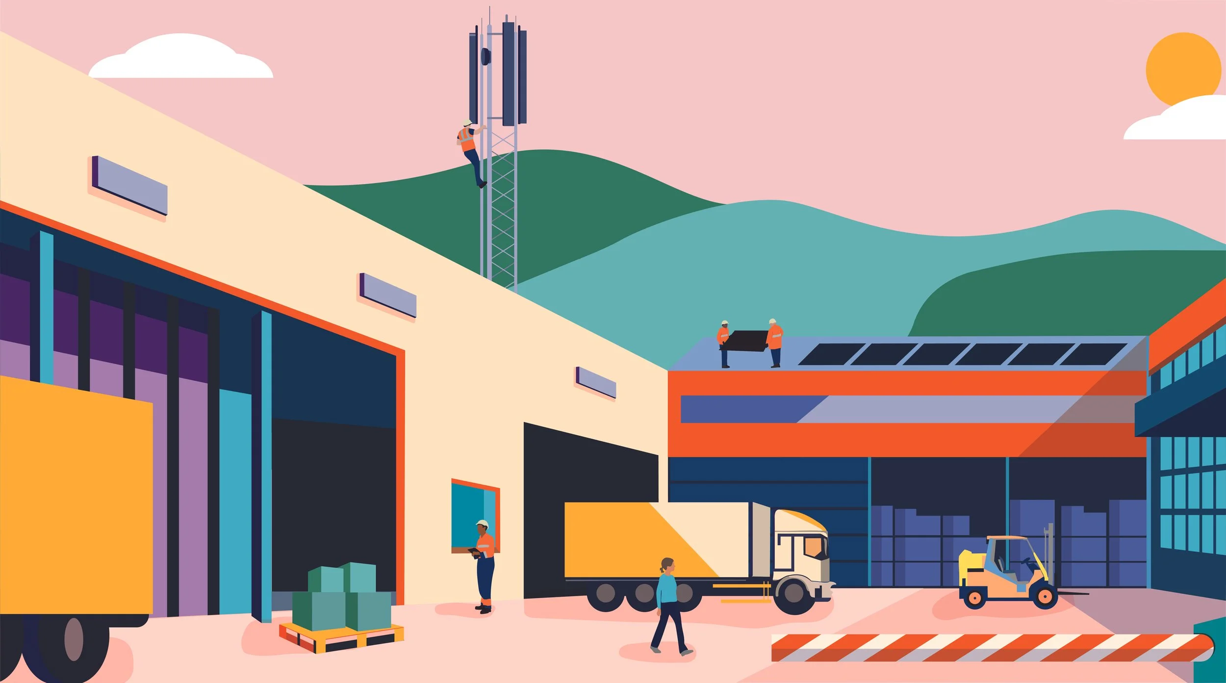
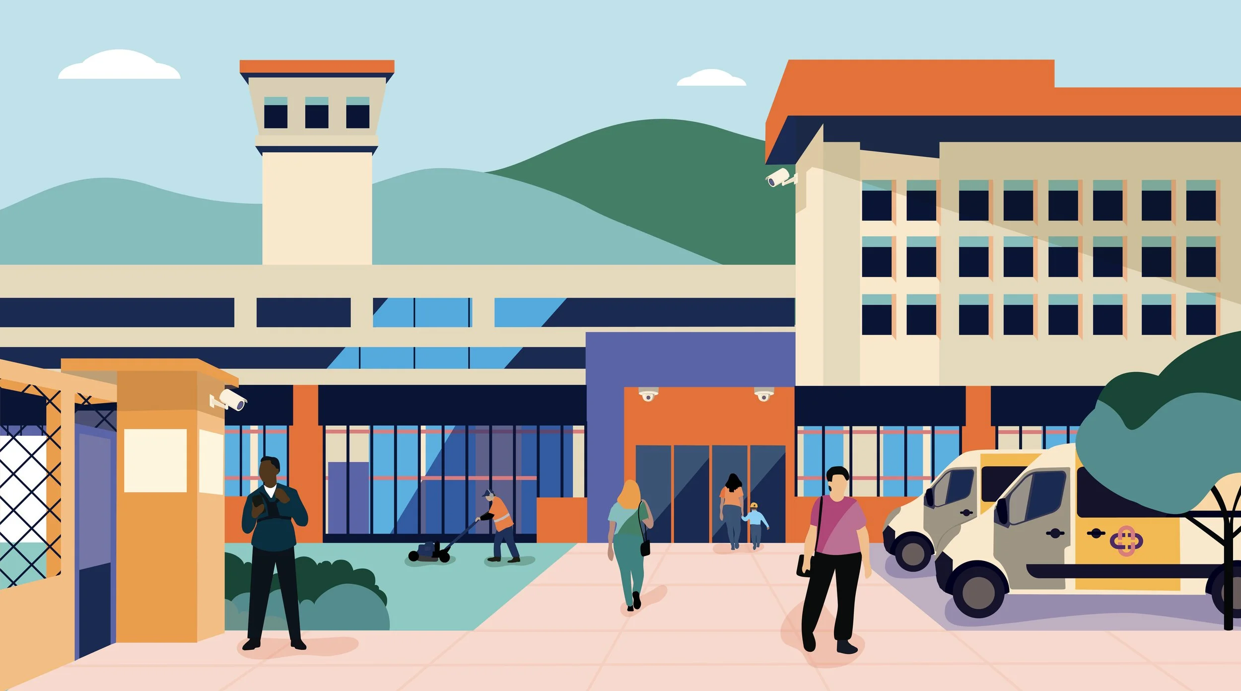
After the agency phase, I took the project in-house, building a 150+ slide PowerPoint presentation, setting up a DAM and guidelines system, created a new illustration style focussing on Mitie sectors, facilitated various spotlight meetings, taking colleagues on the journey of branding and the importance of the new brand and many more.
My involvement

Presentation template with examples

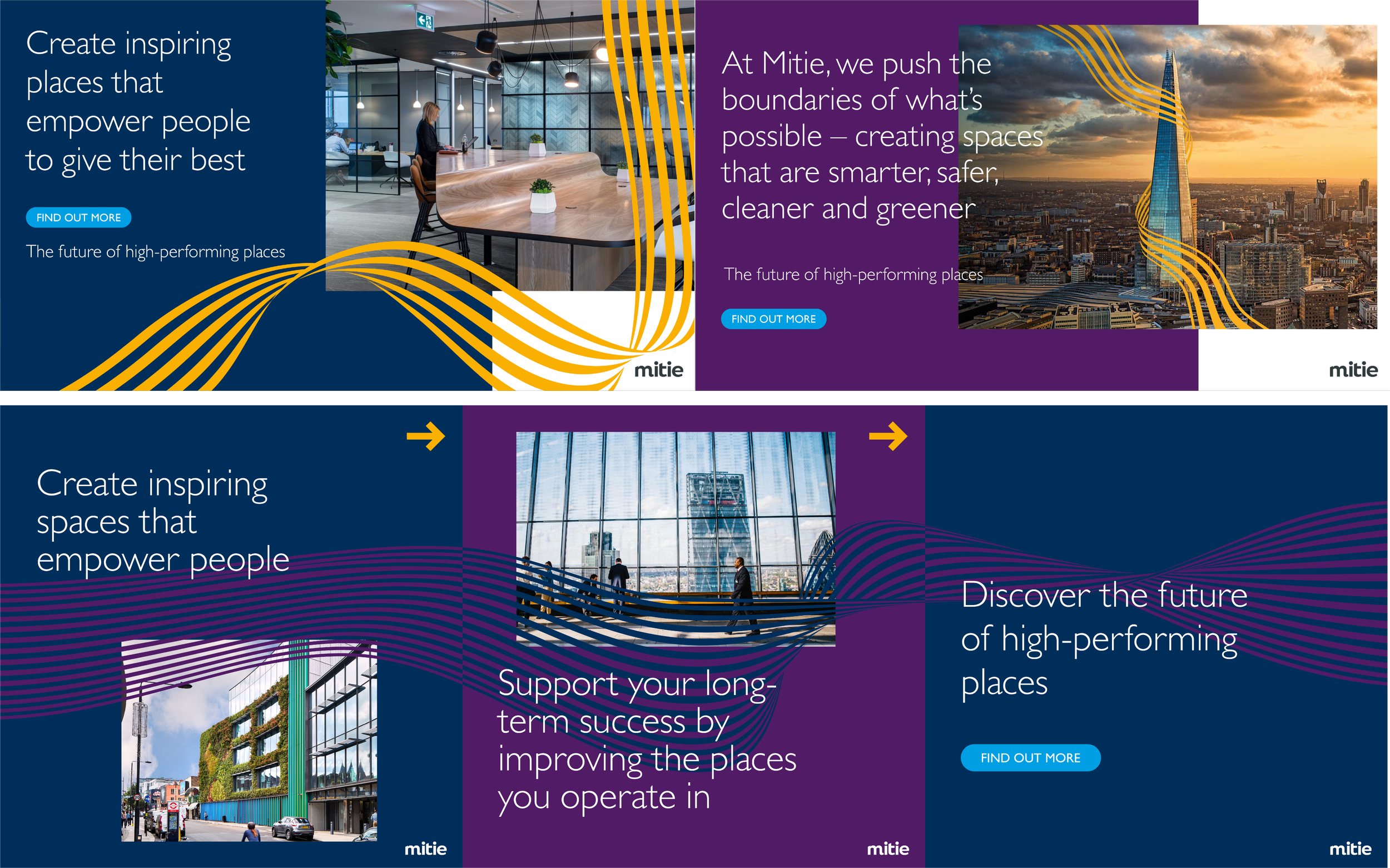
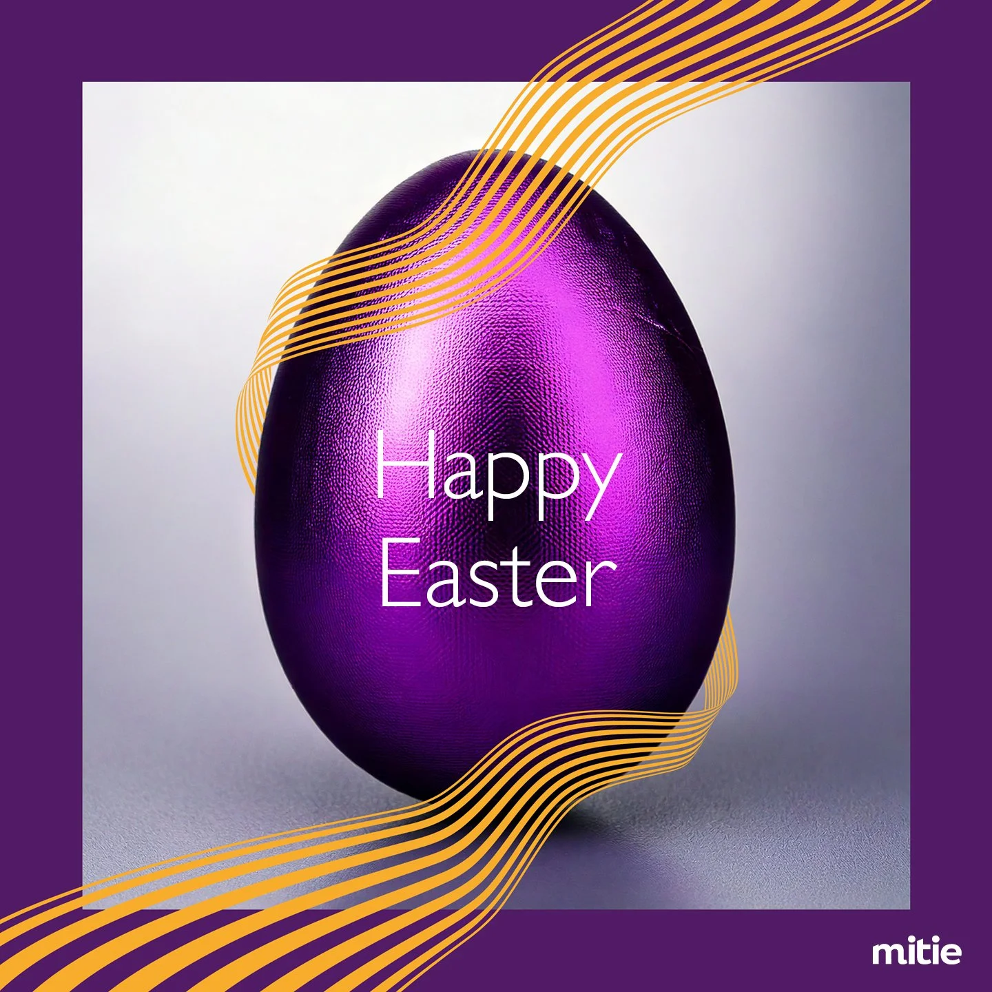
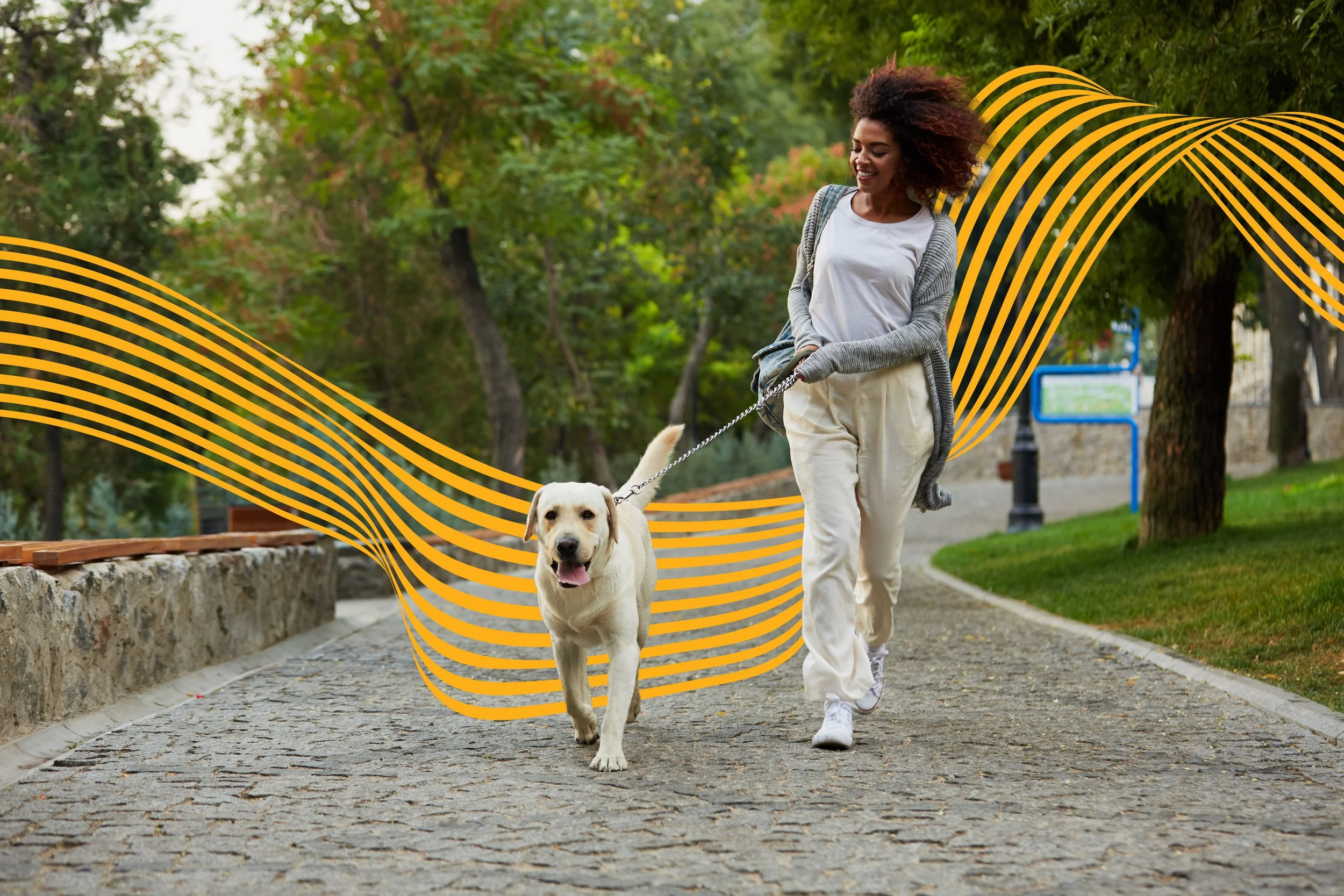
New social styles incorporating the new core colours